Cut+Paste Fest
UI/UX + Branding│Student work│Spring 2021
Cut+Paste Fest is an international festival centered around contemporary collage.
Aesthetic Decisions
While creating the brand aesthetic I had to consider how the various elements and colors would interact with the featured artworks, which is central to the festival and the website. I wanted to balance a bold and clean look, as there was a lot of information that had to be well organized and easily accessible. I decided to go for a minimal color palette, alternating between blue and white background with red accents, focusing on geometry and layering.
Creating the Website
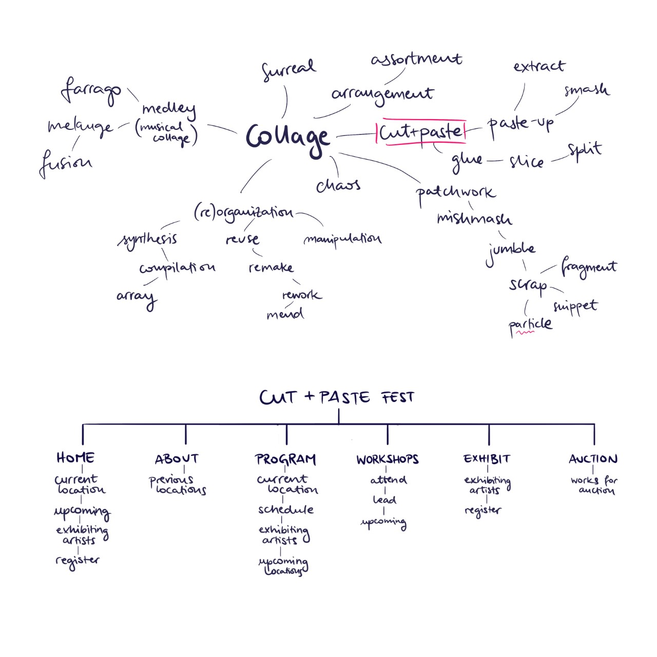
The first step in creating the website was brainstorming the name, looking at websites with similar themes, and coming up with necessary sections and organizing them in a logical manner to create a sitemap. I proceeded to do lofi sketches in Procreate, fleshing out the website structure, before switching to Xd. I planned out a mobile version of the homepage, in which I made adjustments to the column layout and menu to accomodate for the smaller screen size.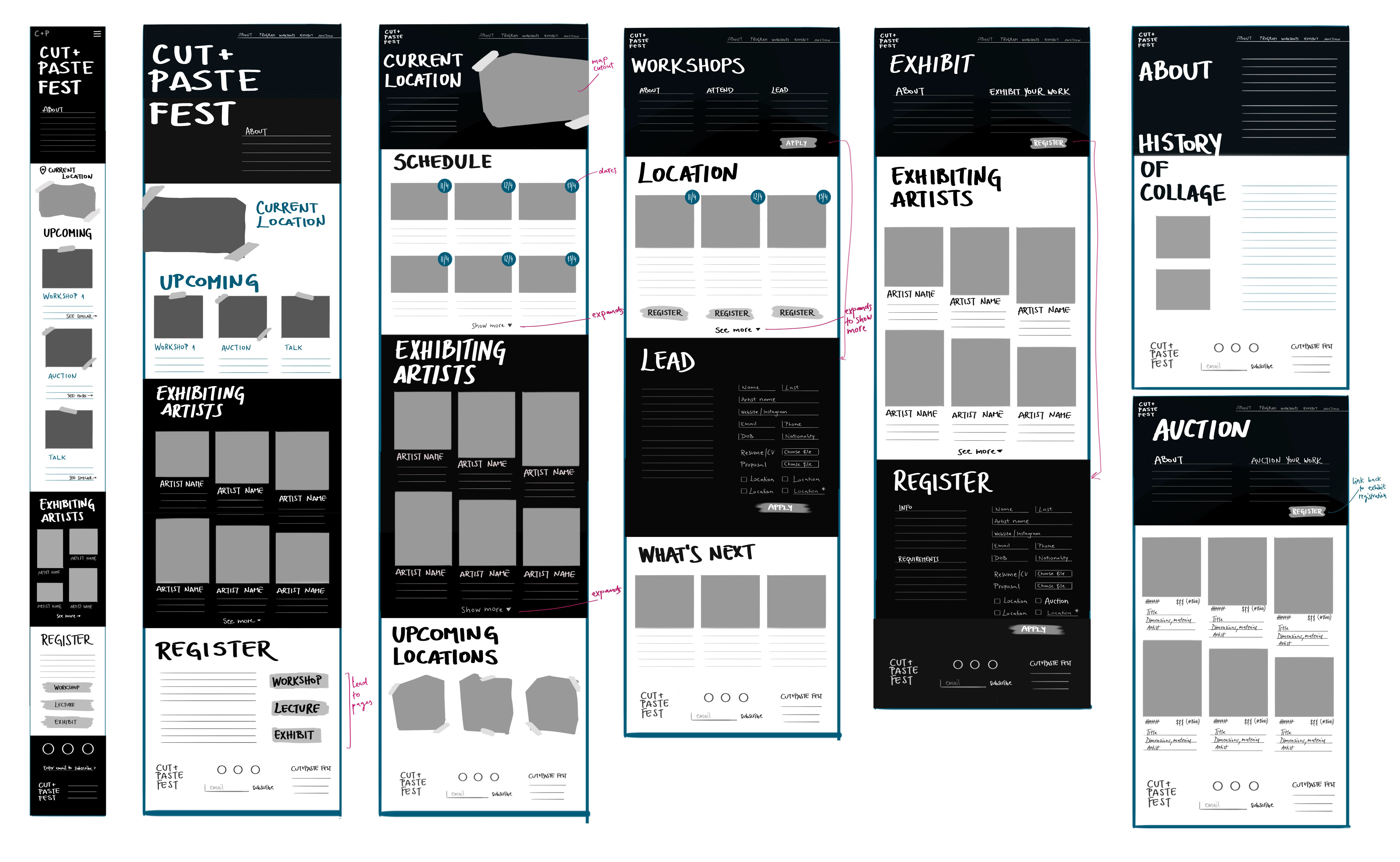


Branding
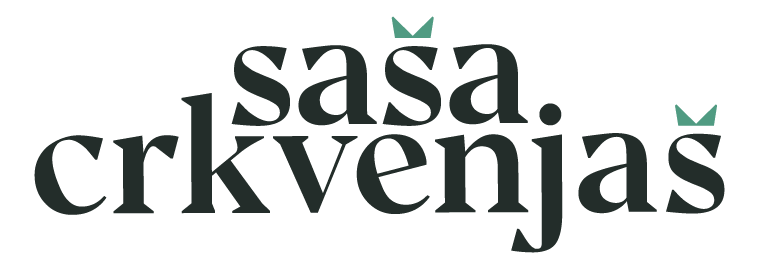
I wanted the logo to be graphic and reflect the theme of the festival. Shuriken Boy is a bold, decorative typeface that is characterized by geometric shapes and rounded corners. I paired it with Space Grotesk, which is a legible monospace font that contrasts the dynamism of the logo. Since there is a considerable amount of text, I went for Roboto as it is very legible and friendly.Collages
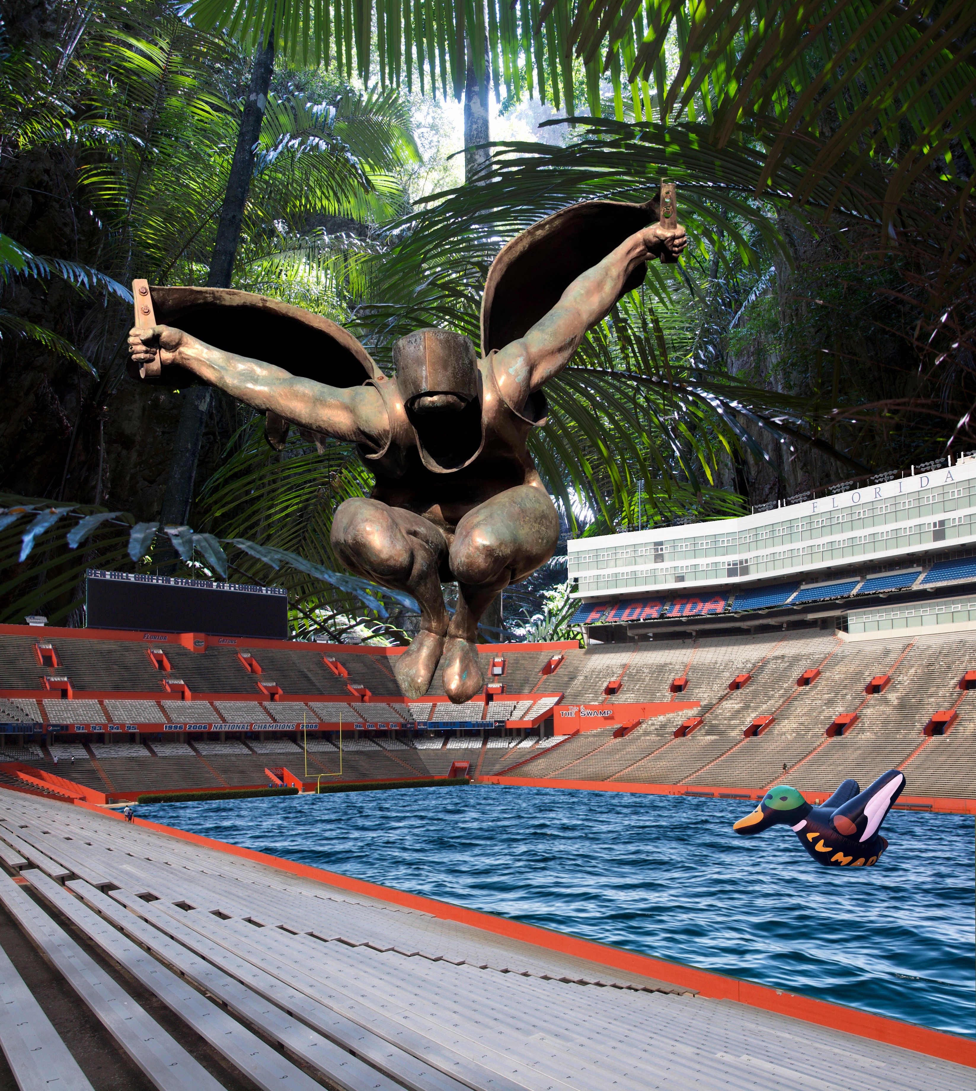
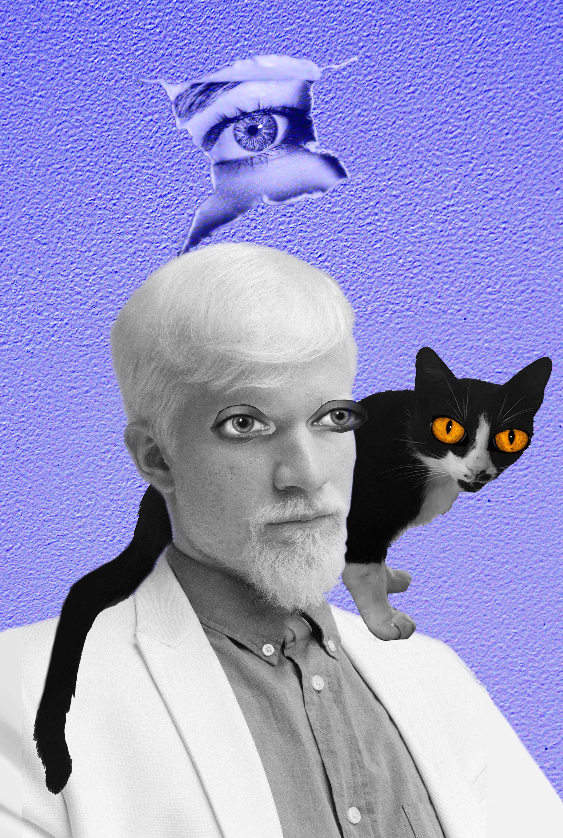
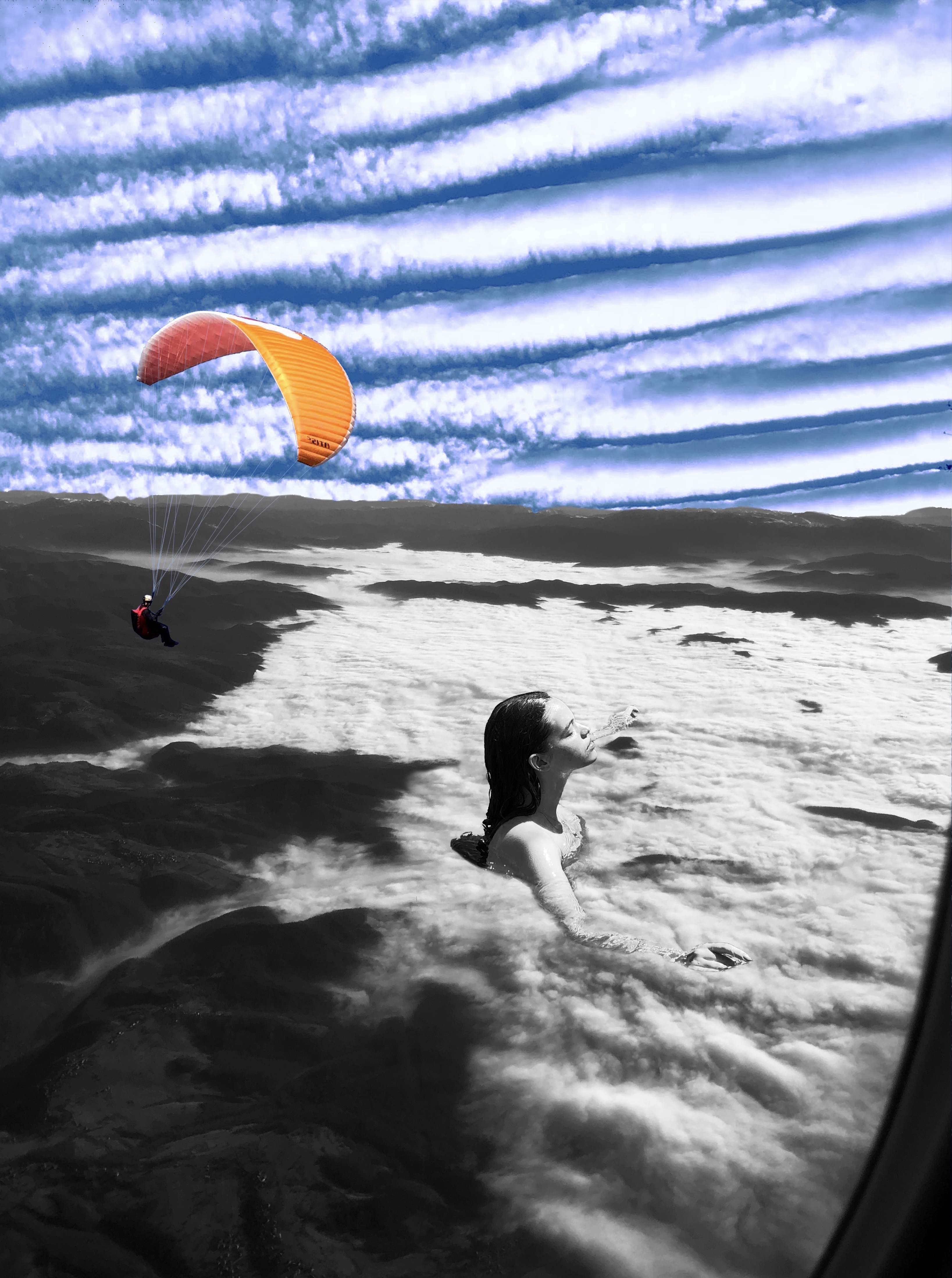
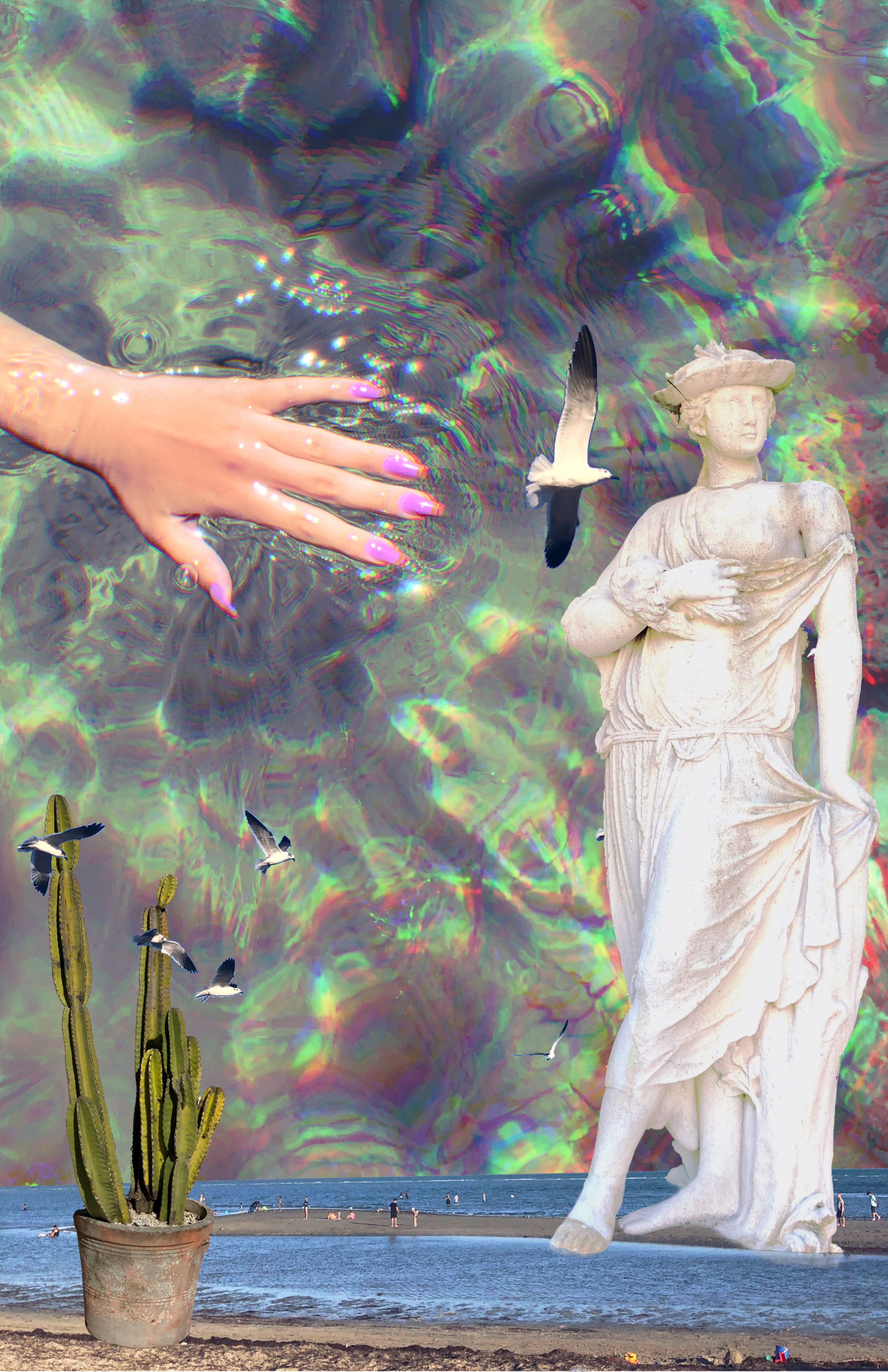
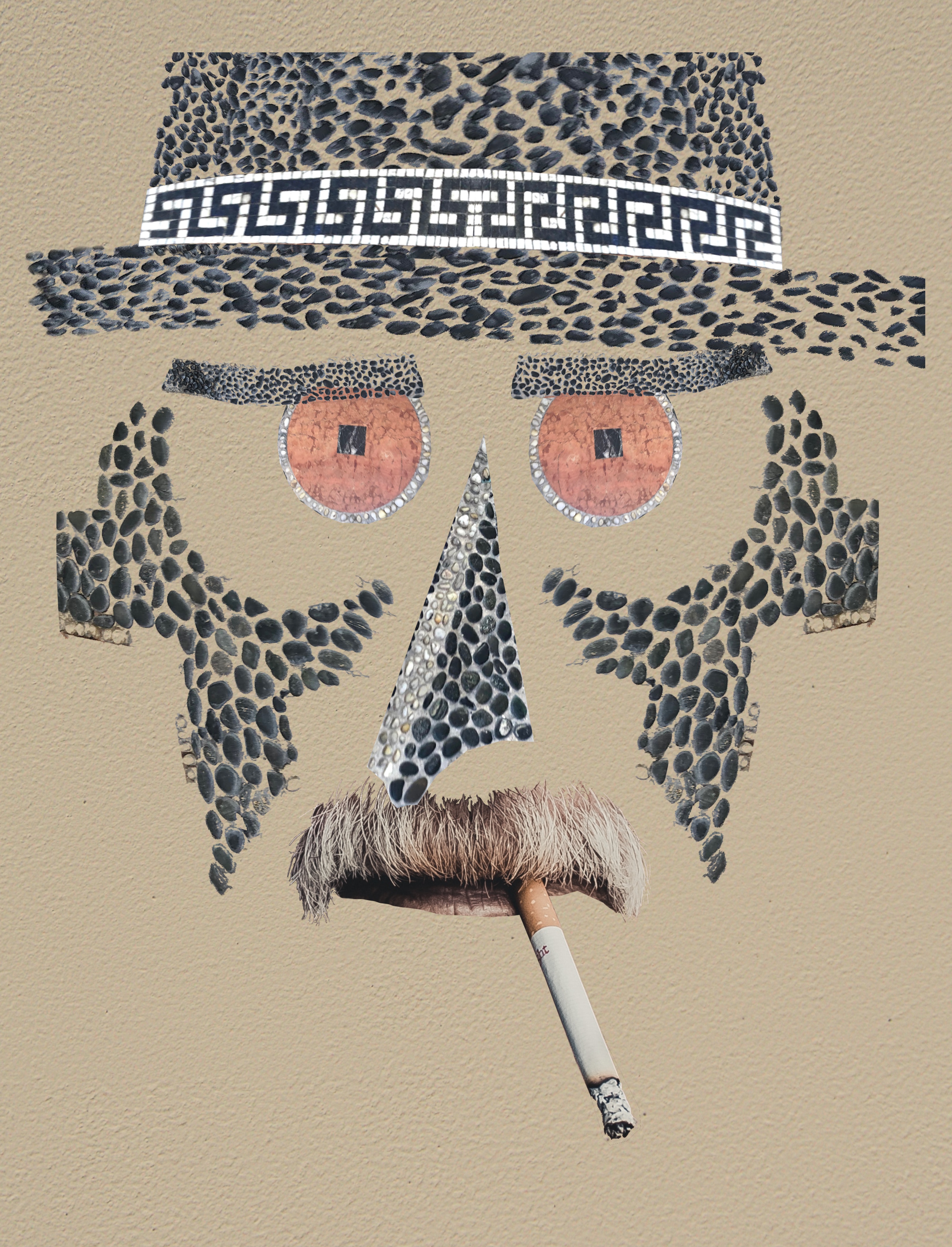
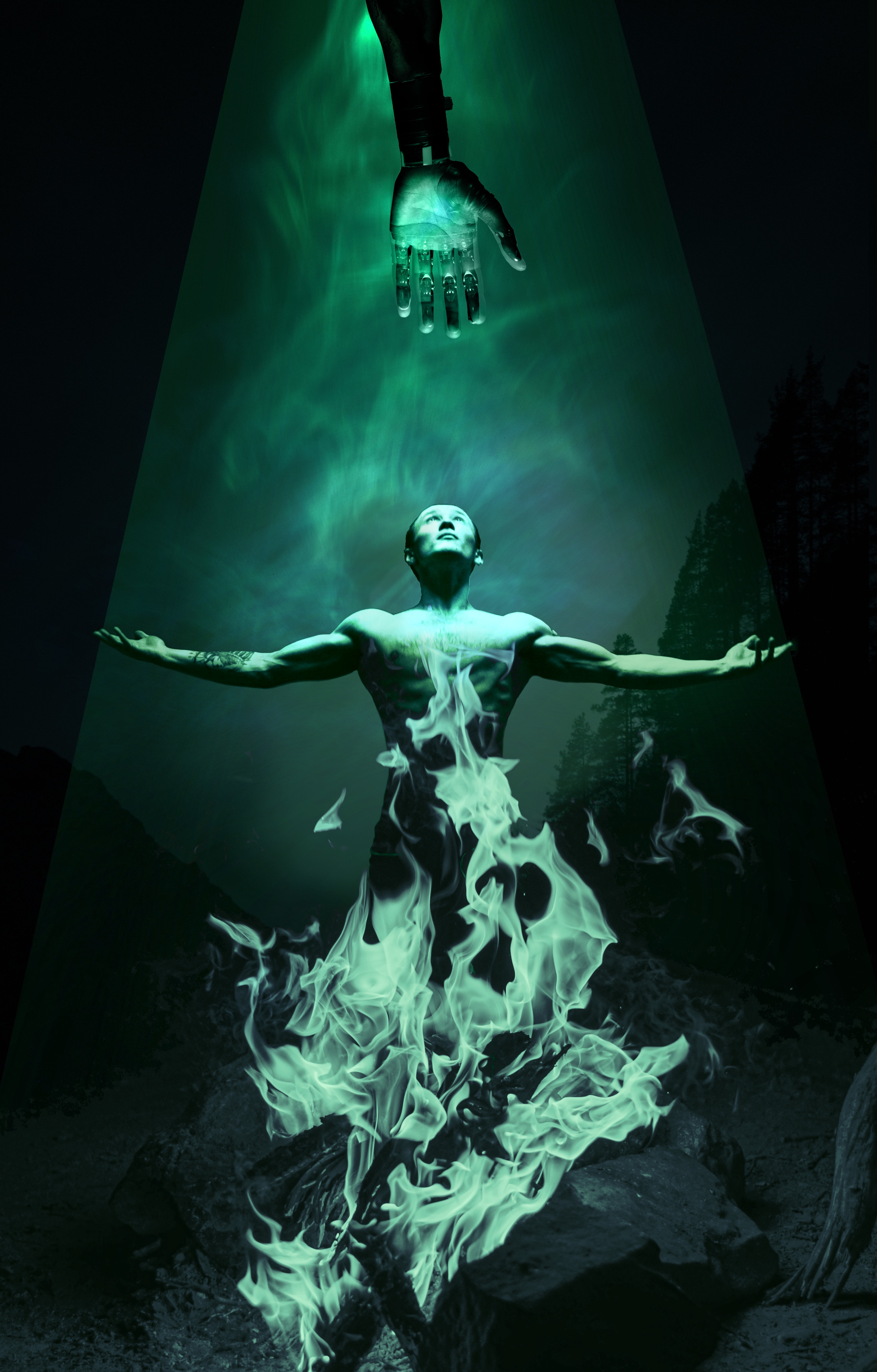
Making collages for this project was a fun process since I looked at various collage styles and emulated them, in order to create a variety of works that would reflect artists of diverse backgrounds. I generated names of international artists, wrote short biographies, and named their works in different languages.


Final Layout
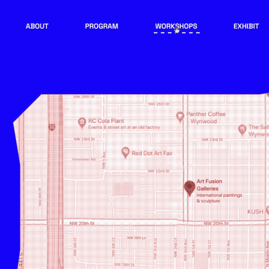
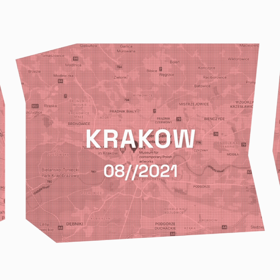
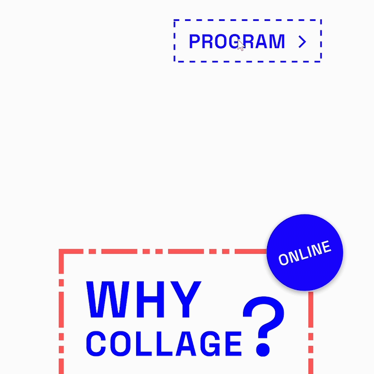
After writing all the copy and finishing the layout in Xd, I worked on adding elements and subtle hover animations that would help with navigation and embody the subject of the festival. Images of maps are of irregular shape and tinted red to fit the color scheme.Layered shapes help direct the viewers attention to important events, and a variety of dashed lines add visual interest.