IBhelpin’
UI/UX│Adobe Jam│Fall 2021


IBhelpin’ is an inclusive app focused on volunteering opportunities for IB students.
Problem
We had a week to create an inclusive app for high school students of different backgrounds and abilities looking to
volunteer. Since both my project partner and I graduated from the International Baccalaureate program (IB) at an international boarding school, we decided to make an app that we believe would help IB students fulfill
the community service requirement. My part in the project was creating the app prototype, whereas my partner Julia worked on
the illustrations and copywriting.App Structure
We started off by brainstorming all sections the app should have and then organized them in a map. We thought about tools that we would have found helpful while attending an IB school, and considered the international environment of IB schools in adding certain adjustments within the app.

Process
Since we had limited time for this poject, I did some quick sketches to sort out my thoughts and quickly plan out content, and then switched to working on wireframes in Xd. Visible above are initial wireframes for the signup process and how they look in the final version, with the added branding components. Some big changes between the draft and final is the added language and accessibility tab on the first page, and the option to choose between uploading a picture or picking an avatar.Shown here are wireframes and final screens from within the app. We decided to use the icons for categories as labels for events, and incorporated a slide up screen with additional information that opens when an event is selected. It was important for us that the user is able to filter their search results and see them on a map, to ensure they can find an event that best suits them and their needs.
Accessibility Features
The international nature of the program is something we considered while designing the app. We remember having classmates that attended our boarding school who were still in the process of learning English which is the primary language of the IB program, so we wanted to make sure changing the language is an option right from the start. Additionally, users can also pick their preferred date, time, and distance formats, ensuring there is no confusion or missed deadlines. Included are accessibility options and adjustments for colorblindness, which we tested for both visibility and aesthetics.IB Features
An important part of completing the service requirement for IB students is writing reflections. In our and our friends’ experience, writing reflections was often forgotten due to an overwhelming amount of schoolwork, causing even more stress. For that reason, we decided to integrate reflections in the events tab. That way once you complete a volunteering session, you can easily access the event info and complete reflections within the app.

The Mascot
We used the mascot to show
the user around the app to ensure they know how to navigate it. After the signup process, the bee gives a tour of all the tabs and explains what can be found in them. It also pops up within the app, as can be seen on the second and third screen, to let the user know about reporting an event or simply give them an encouraging message. The bee is always easily accessible as it sits right next to the logo at the top, so the user can tap it any time they feel lost.Color Palette
The cheerful mascot is paired with an energetic but still calming color palette, with the goal of providing comfort in the very stress-inducing program. Tabs
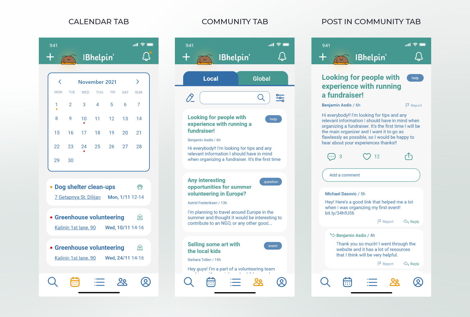
Events are additionally organized and color coded in the calendar tab, allowing the user to see what their obligations for the month look like at a glance. Volunteering is all about building community, so we decided to include a community tab - a place to share ideas and experiences on a local and global level.

