
Plavi orkestar: Soldatski Bal
Branding│Student work│Fall 2021


A visual system redesign for a Yugoslav band based on the perceived identity of music.
Cultural & Historical Context
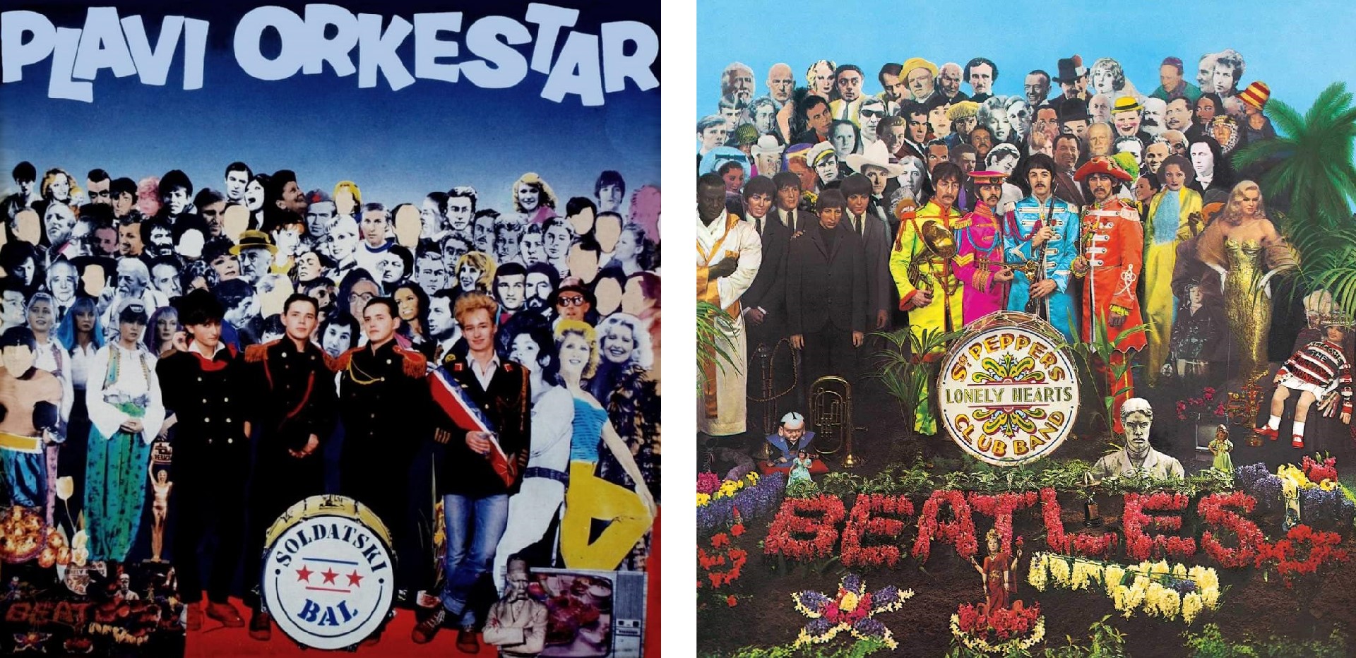
The debut album of Plavi orkestar (The Blue Orchestra) titled Soldatski bal (The Soldiers’ Ball) was released in 1985 and it was the highest selling debut album in Yugoslavia. The band members just finished their compulsory military service and were suddenly catapulted into fame at 20. Created during the New Primitives movement, the album merges old and new traditions, satire and typical Yugoslav humor - a mix which some described as camp.The original album cover was made by a member of a design group Trio, which usually manipulated existing mainstream works to create pieces that were often ironic and implemented elements of the local culture. For this album, they adapted an album cover from The Beatles by including Yugoslav historical and public figures.
Analysis of Sound and Lyrics
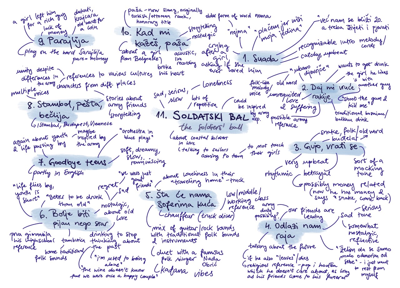
The first step in redesigning the cover was listening to the album and analyzing the lyrics and sound. Since the album was partially written while they were still in high school, a lot of the songs deal with relationships, unrequited love, and breakups. Some songs mention their military experience. They use a lot of traditional sounds, old words, current slang and combine them with pop rock, resulting in something like folk rock.Research
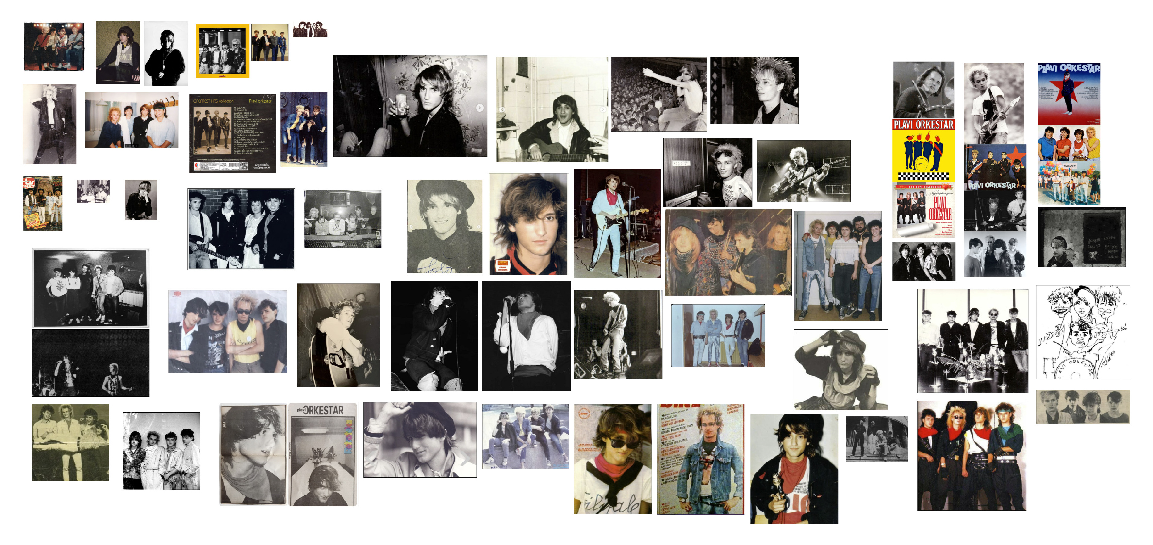
Looking for visual references, I did extensive research on discogs.com into the band’s discography, other bands that were popular at the time this album was released, both locally and globally. I also looked into what contemporary bands that have similar energy are doing today. One of the most challenging parts of the research process was finding good quality pictures of the band at the time of the release.I found that there were no unifying elements between Plavi orkestar’s albums, no similar colors, typefaces, or imagery. I wanted to create a logo for them that is timeless, considering they have been active since 1985, and without consistent branding.


Visual Language
Working on the moodboard and then defining the visual language, I thought of various textures, patterns, colors, typefaces, and other imagery that reflects Yugoslav spirit and humor. Talking to my mom about the 80s in Yugoslavia helped me a lot, since she could provide me with a lot of important references and information that I could not easily find online.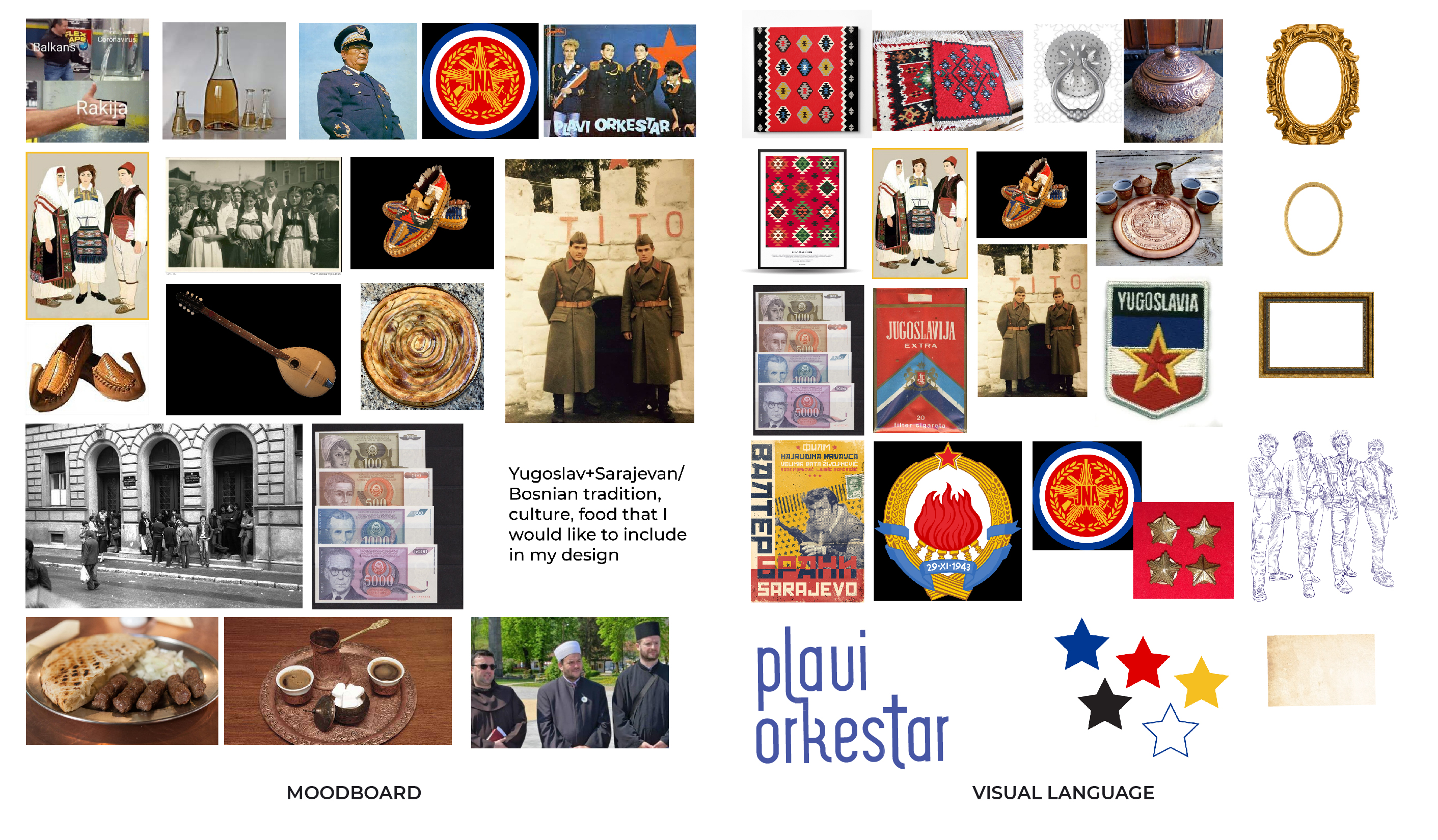

Designing the Album
I thought a collage would be a good fit for this album because I could create a scene that reflects the times in which the album was made and encapsulate the Yugoslav culture and humor. Through research and my mom’s advice, I slowly gathered elements to use in the scene that embodied camp, but were still accurate for the 80s.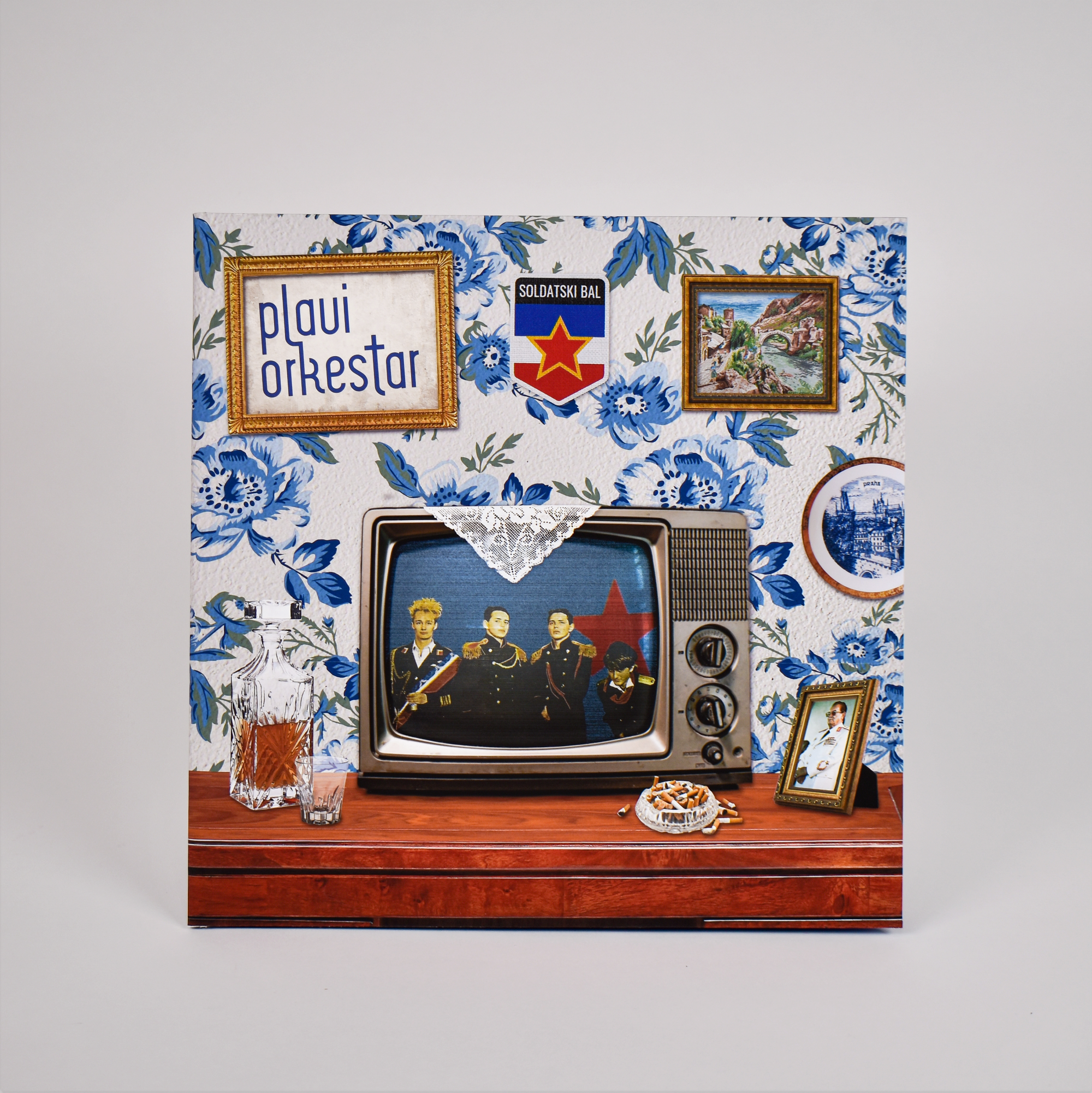


Final Album Design
Every element on the cover reflects the spirit and culture of Yugoslavia. The name of the band is framed on an aged piece of paper, and next to it is a reference to the Yugoslav military badge with
the name of the album. From the framed tapestry and painted plate, to the framed picture of president Tito,
the traditional drink rakija, this scene is an exaggeration of what a typical Yugoslav home looked like. The scene is completed by the white crochet piece covering the TV,
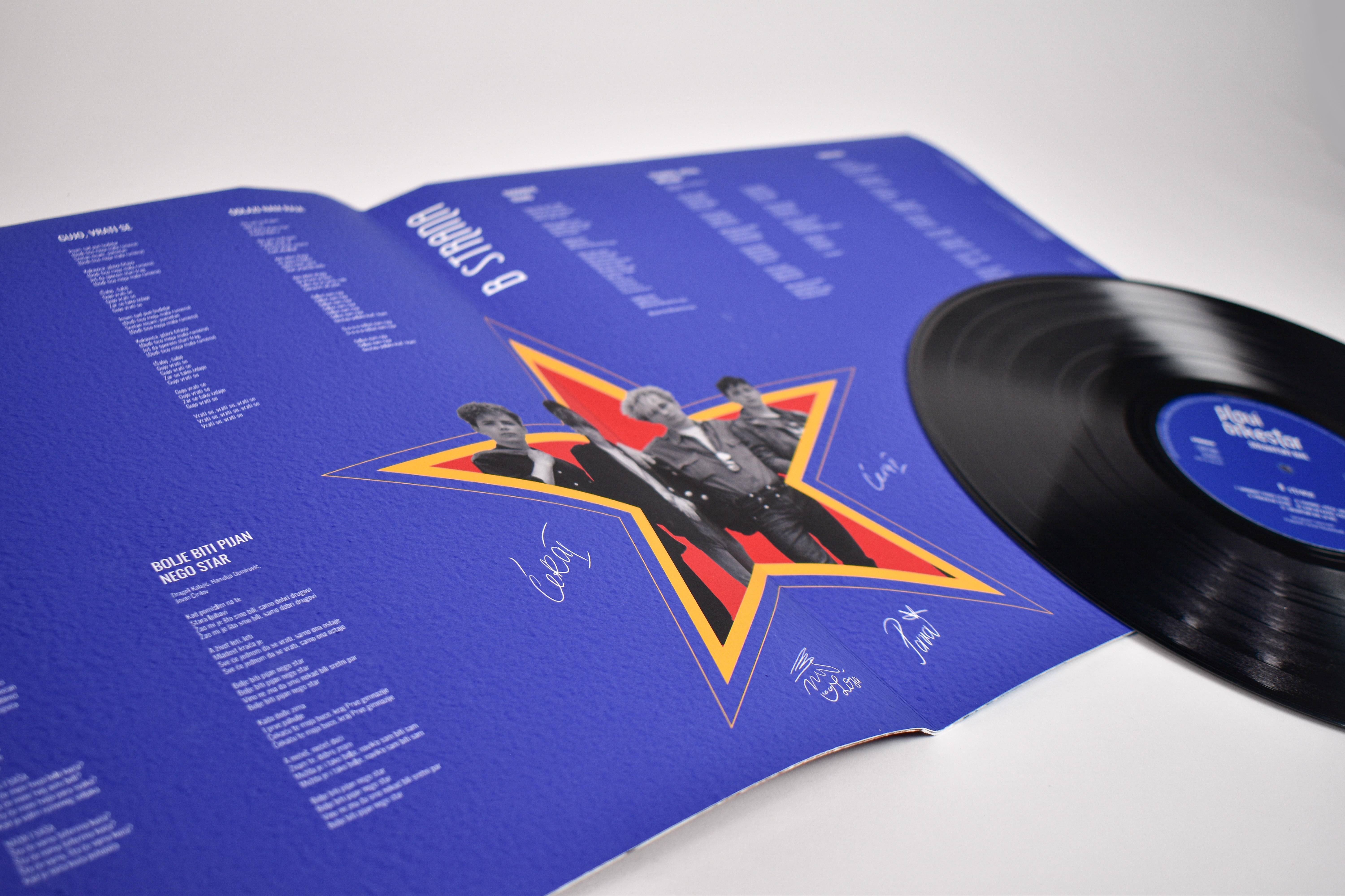
which seems to be a cross cultural grandma decor piece according to my classmates.The back of the album features the song list separated by sides. Inside the gatefold album are the lyrics along with signatures of the band members. I made sure to include all information from the original album, such as the label and credits on the inside and back of the album.
Vinyl Labels
For the vinyl labels, I referenced images from discogs.com to accurately recreate them. I traced the Jugoton logo and found fonts similar to what the other information uses, and paired it with a recognizable blue color - referencing the band’s name (plavi means blue).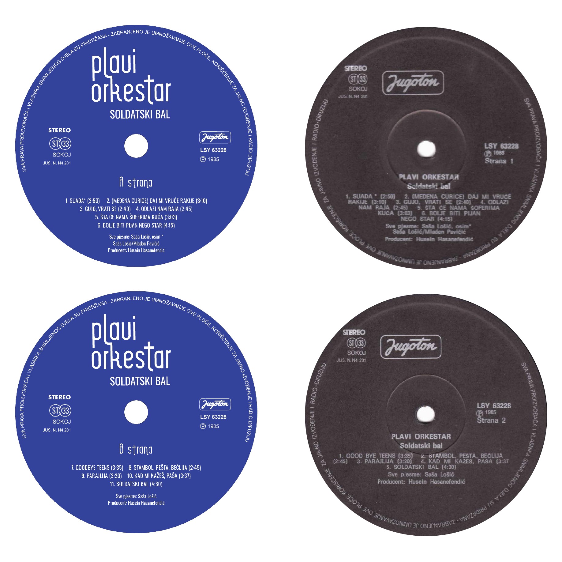

Concert Poster
Since some of the band’s songs were written while they were still in high school, I imagined
them having a concert and donating proceeds to the school. I recreated a typical high school
desk that is decorated with carved names and doodles, as well as books that would be part of
the curriculum. The poster features the illustration of the band members and the entrance of Prva gimnazija, the high school the event is dedicated to. 
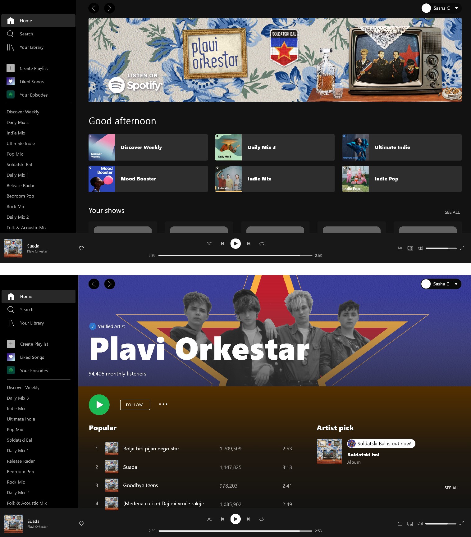

Spotify Banners
Spotify requirements for the banner do not allow promotion of any events, text, or busy backgrounds, so I just used an image of the band with the star to make the branding cohesive. The banner ad doesn’t have any similar restrictions, so I rearranged some elements from the album cover to reflect the feel of the album and grab the viewers attention. I also reformatted them to be used while a song is playing.