Stride
UI/UX│Student work│Spring 2021

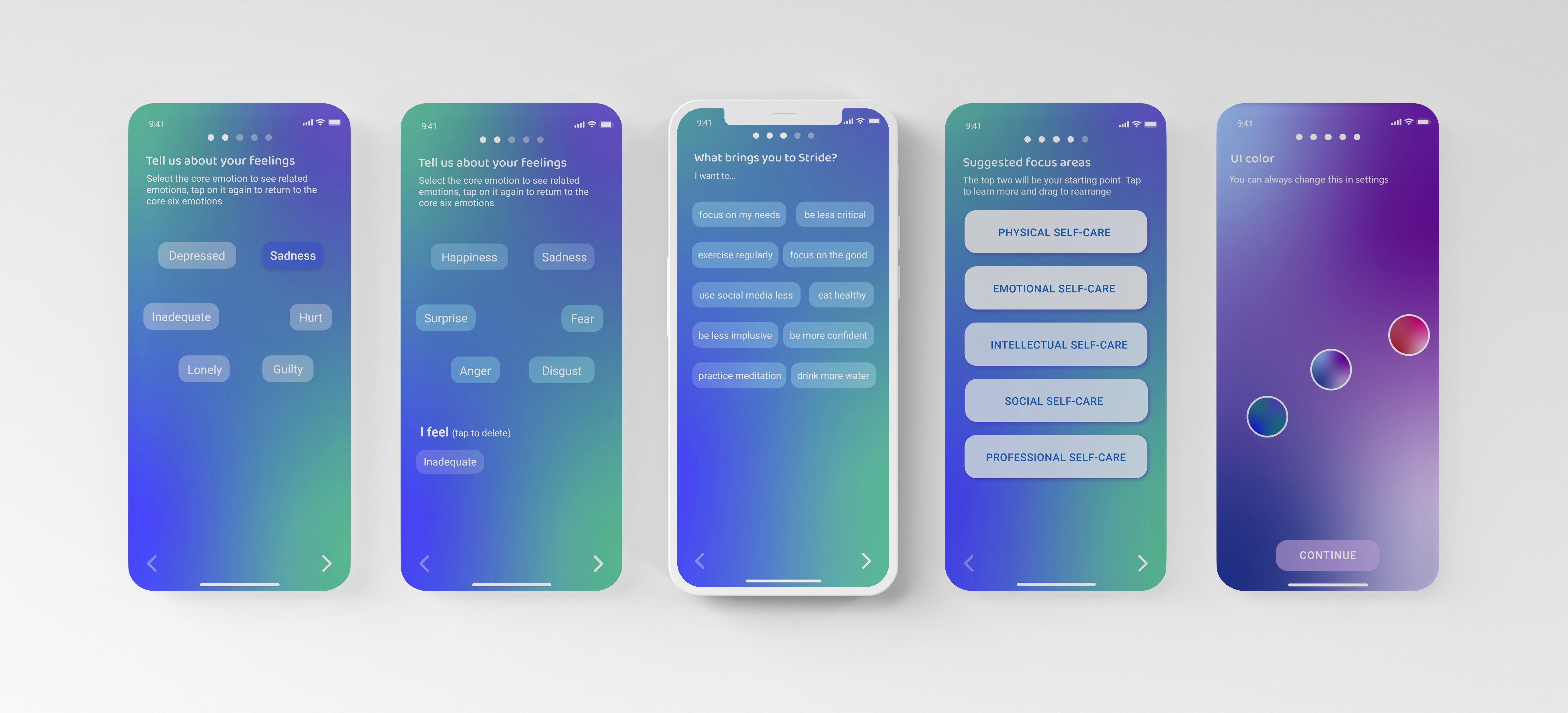
Sign up process for an all in one self-care app.
Problem Identification
I started my research by looking into existing self-care apps and realized they all target very niche aspects of self-care. If you wanted to work on multiple types of self-care, you would have to download an app for each area. Having to use
multiple niche self-care apps creates stress, and making sure you
update your progress in each easily becomes overwhelming.A proposed solution would be an app that uses AI to create a customized self-care plan for each user based on their goals and preferences, covering all areas of self care and eliminating the need for multiple niche apps.
Personas
After identifying the problem, I worked on creating some personas that would help me make this app suitable for a range of needs.
Lo-fi Sketches
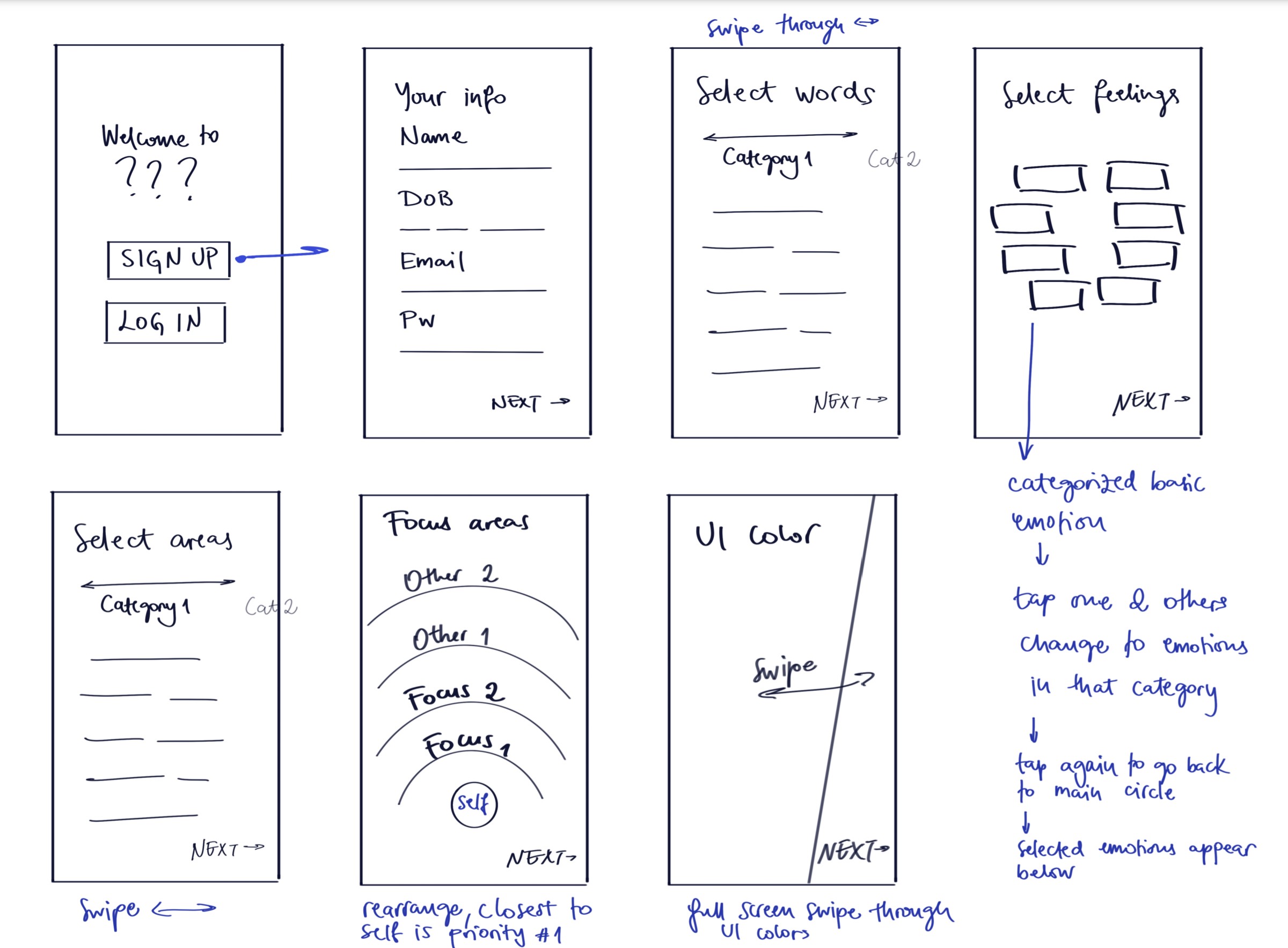
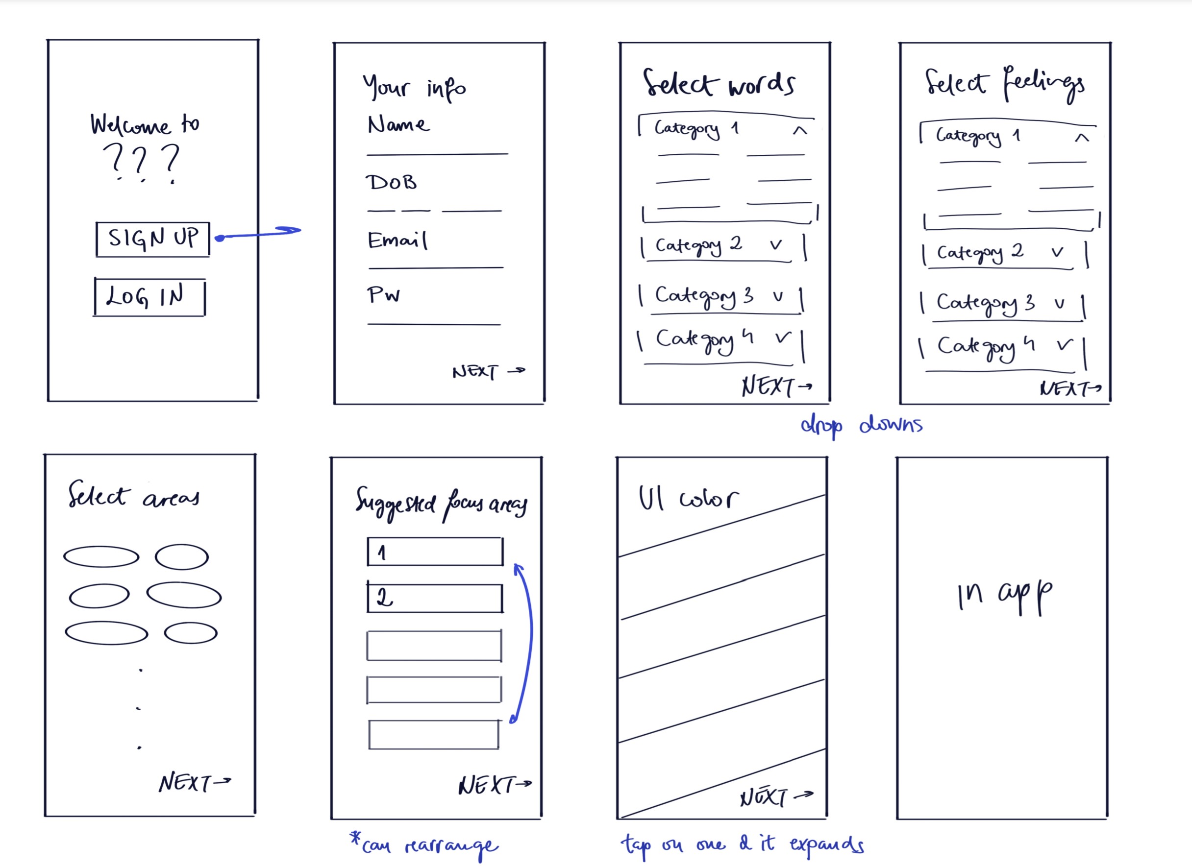
I downloaded about 10 apps and went through the sign up process. I noted down the formats they used to collect data from the user, which helped me develop a rough wireflow for my app. I tried to brainstorm a couple of different variations for each screen, thinking of ways they could be improved and made more intuitive to navigate.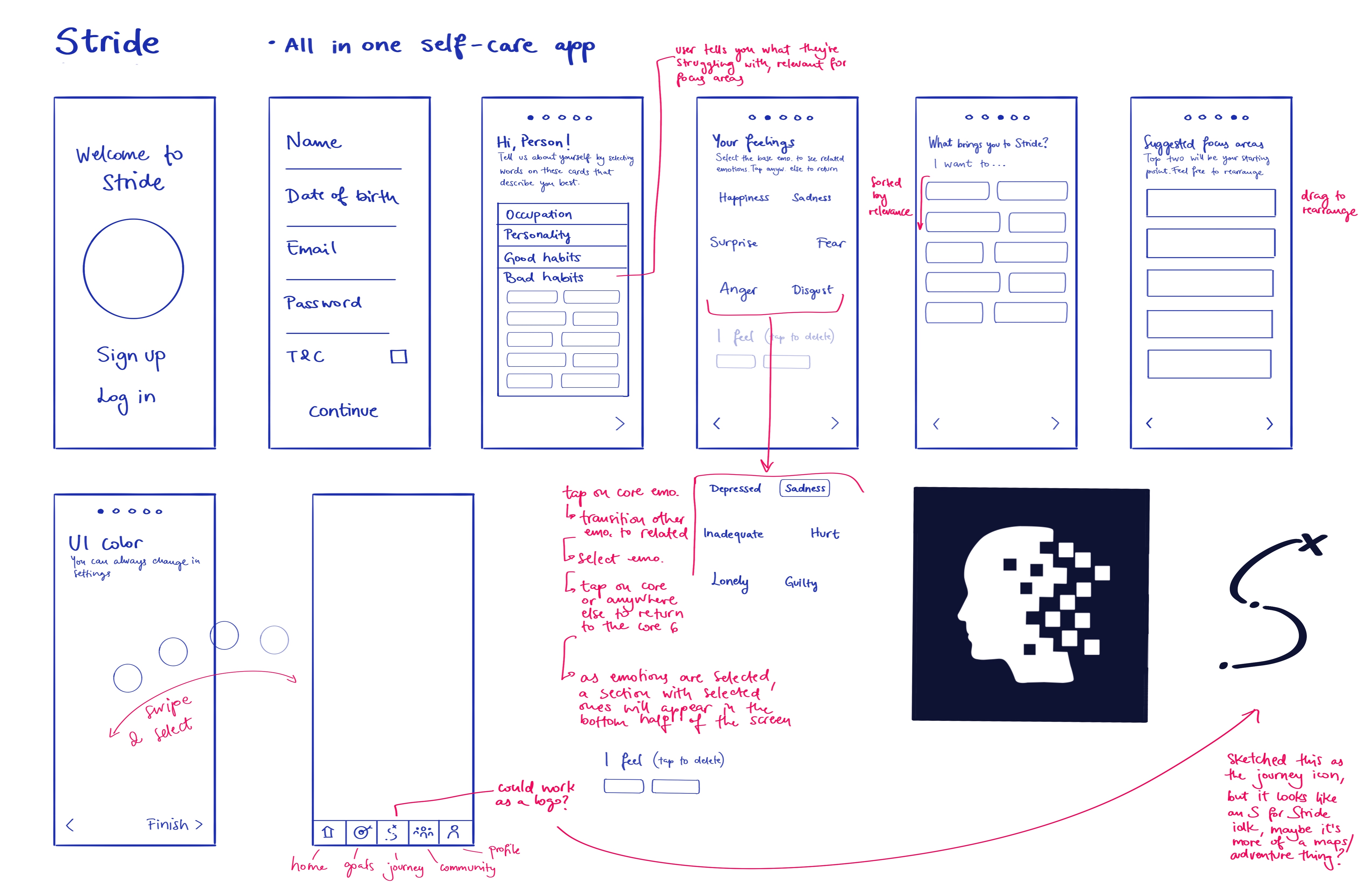
Improvements and Hi-fi Wireframes
Analysis of the initial wireflow and feedback from classmates helped me pick screens that worked best. I sketched them out in more detail before moving into Xd, where I built a hi-fi wireflow. An important part of the process was finding the right language to use since the app needs to approach the user with a certain sensitivity considering it is a self-care app. Good and bad habits became Areas of strength and growth.Visual Language
Developing the visual language, I researched color and how it
affects us. I opted for colors that most find relaxing, but I also
made some more energetic color schemes. I wanted this app to
be feel like a safe space for the user and to encourage them ontheir self-care and self-improvement journey.

